ML Cards for D/MLOps Governance
Machine learning without proper attention to code or data is futile. But how do you approach data and machine learning governance in practice? With cards!
Many companies struggle with data discovery, data governance, and machine learning operationalization. When data is incorrect, downstream data sets will be wrong too. Features derived from that data will suffer, which in turn means the performance of machine learning models will deteriorate during training or tuning, decreasing the predictive power of models once deployed to production. Any downstream consumers of that model (e.g. backend services) will be negatively affected by it too.
Corrections need to cascade all the way down, which can be both costly and time-consuming. It is even worse with undeclared consumers of data, features, or models: there is no way to notify teams in case of issues or if they have to backfill or retrain. Such data cascades are common, they often go unnoticed, but they are not unavoidable.
Negative side effects quickly compound in cascades with plenty of data producers and consumers. The problem is that if data quality is not addressed at the source, it pops up in every derived data set, every related query, and every dependent machine learning product. Data governance is best not left as an exercise to the reader, as it ranks as the top challenge by many data professionals, irrespective of experience, with data profiling cited as being particularly challenging.
What follows is inspired by related work on data sheets, model cards, and DAG cards, descriptions of similar efforts (e.g. Airbnb, Facebook, Lyft, Netflix, Spotify, and Uber), and of course my own experience. What is novel is the combination of code, data, model, and service cards for D/MLOps, as an integrated solution.
Cards
Our solution must:
- be easy to use and increase productivity for both consumers and producers
- be easy to understand for both data professionals and business people
- treat data as code: from creation through design reviews to deprecation
- make it easy to reach out to teams responsible for individual components
- be end-to-end: full lineage of data sets, features, models, services, and metrics
- be modular to allow extension to additional components, such as experiments
- enable digging deeper: it must reinforce the ‘trust, but verify’ principle
- avoid information overload
Cards meet these requirements in a straightforward manner. With cards, we can encapsulate and isolate information specific to individual components, while having the option of displaying more details and fanning out through user interactions. That said, we must be mindful of different personas: a data professional probably wants to see a lot of info by default, whereas a product person or business analyst does not worry too much about the details. An engineer probably cares more about upstream SLAs and code quality than a data scientist who typically needs to see a health assessment of a data set.
The following cards shall be described in more detail:
Basic Cards
Summary Card
This is the top-level card that is shown upon discovery of any component: data, feature, model, service, or metric.
What is included on the summary card?
- Component type
- Component identifier
- One-liner about component: description and/or purpose
- Owners or team responsible
- Link to documentation
- SLAs (if applicable)
- Last modified
- Component summary
-
Data:
- Verified source badge (if applicable)
- Schedule
- Latency or freshness
- Data quality score
- Usage score
- Preview
- Tier
-
Feature:
- Entity and feature set/group
- Version or revision
- Latency or freshness
- Data quality score
- Usage score
-
Model:
- Algorithm or architecture
- Evaluation metric(s)
- Current model performance
- Service score (if applicable)
-
Service:
- Endpoint(s)
- Deployment environment
- Deployment type
- Service score
-
Metric:
- Current value
- Scope: business, business unit, or team
- Link to dashboards
- Approval status
- Service score (if applicable)
-
Data:
- Community-curated tags/topics
- Lineage score
- Code score
- Cost score
Symbols (, , , , , and ) next to entries indicate information extracted from individual cards described in more detail below.
To make that more concrete, here is a mock-up of the data summary card:
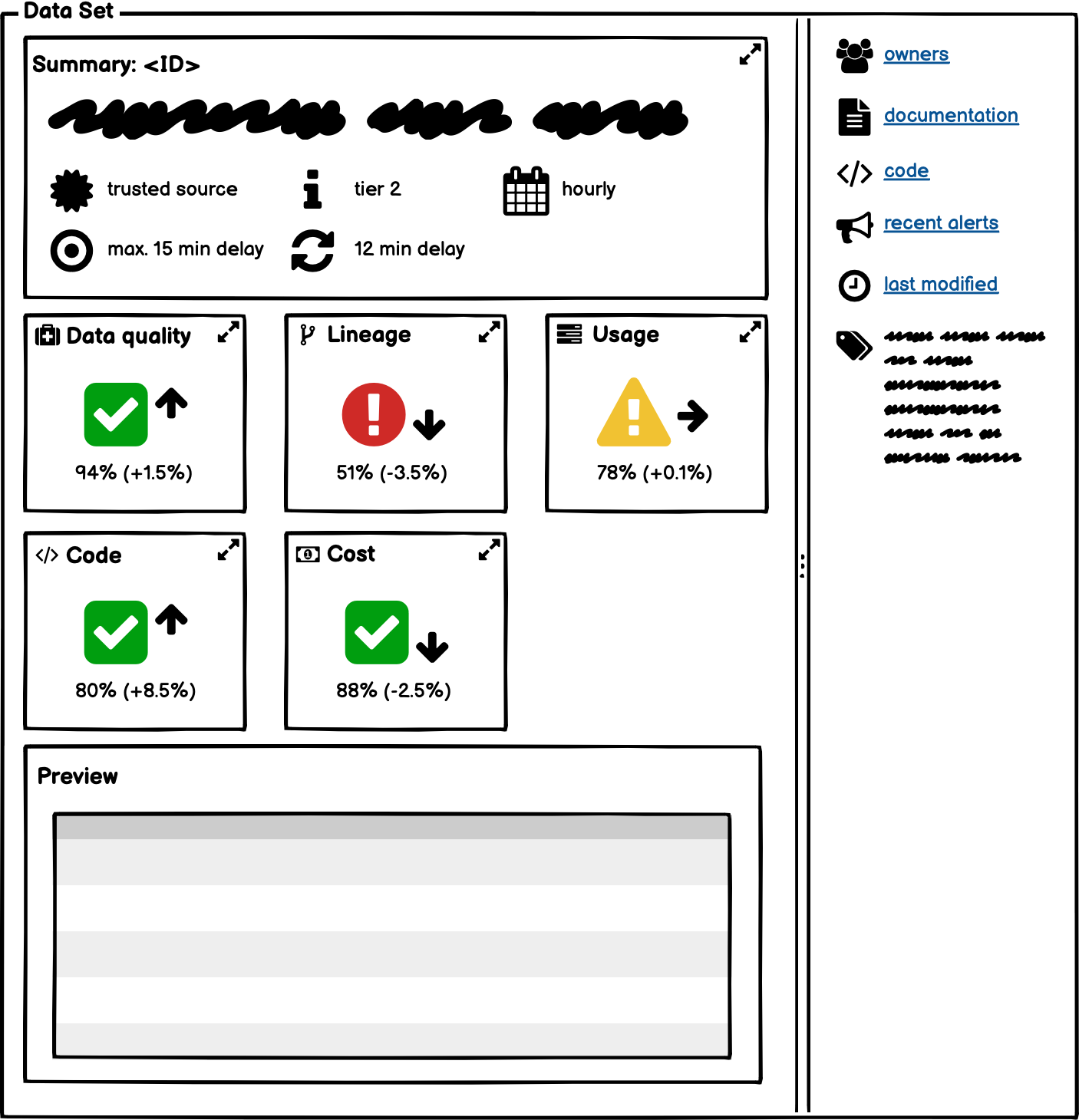
Scores are aggregates of the associated cards. For instance, the data quality score is a combination of the data quality score for each dependency. Such scores can be based on averages or the lowest value among constituents; the latter is in line with a chain being only as strong as the weakest link.
Scores function as entry points to more detailed information to those who seek it. A simple visual indicator à la // is best for accessibility, because the exact scores do not matter too much; // next to the score convey trends over larger periods of time. The idea is to give potential consumers a quick overview of the component health without overloading them with too much information at the same time. Advanced users can of course delve into more details, if they so desire.
Code Card
Since components originate from code, the code card is the fallback for basic information such as owners, recent modifications, and the current status. In general, entries from component cards override information from basic cards (e.g. code).
The code card holds:
- Owners
- Link to code
- Primary language
- Main dependencies
- Latest container image
- Commit activity trend
- Test coverage trend
- Test flakiness trend
- Link to documentation
- Link to issue tracker
- Link to vulnerabilities scans (if applicable)
- Issue resolution time trend
- PR turnaround time trend
- CI/CD success rate trend
- Link to most recent PRs
- Badges (if applicable)
These items pertain to the team’s activity, code coverage, and compliance with in-house style guides. They are by no means indicative of the overall quality of the code base, but they may hint at its health, whether it is actively maintained with proper test suites to cover as much of the code as sensible, bugs are fixed in a timely manner, security is taken seriously, and so on. If there are any issues with a recent version, the links to the last few PRs can aid in the quick identification of the problem. Similarly, the main dependencies are listed, so anyone can see whether the code uses the latest recommended libraries or is still running on an outdated stack or unsupported technology.
A badge can be used to indicate compliance with internal standards. A test certification programme with different levels indicating whether best practices are being followed is a possibility in large engineering organizations:
- Basic repository setup, monitoring, and alerting
- Basic level of code coverage and security
- Quality of component: data, feature, model, service, or metric
The code score summarizes the health of the code base, not the component itself. For a machine learning model, for instance, the code consists of the entire machine learning pipeline with relevant orchestration configuration. The model architecture, the selected features, or the model performance are not relevant to the code score.
Cost Card
- Total cost trend
- Cost by resource: storage, compute, memory, networking
- Utilization by resource: storage, compute, memory, networking
- Total cost by MAU trend (if applicable)
- Total cost by GB trend (if applicable)
The breakdown by resource is to identify the most expensive resources; idle or over-provisioned resources can easily be spotted with the utilization by resource. Compute can be further split into CPU, GPU, TPU, FPGA, or ASIC, as applicable.
By showing the total cost divided by the number of monthly active users (MAU), teams can identify runaway components for which the costs increase with each additional user. Such components do not scale in the long run. Analogously, the total cost by GB stored for a component can be important to observe over time, to see whether the cost to hold a data set or operate a backend service’s storage does not become more expensive per unit of data as time goes by. This could hint at flaky data pipelines with lots of backfills, network traffic that might be avoidable with better sharding or partitioning, non-linear scaling of replicas, and so on.
The cost score depends on the priorities of the company: a high-growth start-up may not feel the need to squeeze out the cost per unit as much as an enterprise. The former may prefer to see the cost per user to ensure it is accounted for correctly in the customer lifetime value.
Lineage Card
Since we desire to have an end-to-end solution, lineage is a basic card that comes with each component. It contains:
- DAG
- Availability timeline
- Queue time trend (if applicable)
- Execution time trend
- SLA hit rate trend
- Recent alerts
- Downstream consumers
Lineage deals with what goes into a component, which is why it contains the DAG. Ideally, the DAG is annotated with data quality scores for each data set that flow into the component. If the workflow orchestrator supports an emergency brake mechanism, the DAG can show which upstream and downstream components are affected by it. Components that are late due to an emergency brake in an upstream component can easily be spotted. Any recent alerts are shown, so it is clear what the status is for each node in the graph:
Data is often fed through to a learning system from various upstream producers. These upstream processes should be thoroughly monitored, tested, and routinely meet a service level objective that takes the downstream ML system needs into account. Google (2014)
The execution time trend shows the execution time of the current component (e.g. a data pipeline, machine learning model, or microservice) over time. Together with the typical availability of all upstream inputs and the time in the queue, the earliest possible availability time for the current component can be deduced. If the SLA is too tight, it can be flagged before it is breached.
The lineage score can be either the SLA hit ratio or a compound data quality score for all upstream dependencies.
Component Cards
Henceforth, a indicates an expandable section of a card. When users open a component card, these sections are collapsed and show either a current value (e.g. data set version or model performance metric) or the total number of entries in the section (e.g. number of features selected).
Data Card
My (Unfortunately Realistic) Rules of Data Quality™ permeate the data card, which is the key entity as it feeds features, models, and services. By making sure all assumptions and expectations are explicit, everyone can check the veracity of claims independently.
Proper usage is encouraged by linking to documentation and listing common access patterns. The aim is to have better data through increased transparency. Transparency alone won’t fix issues with data, but it can help in exposing problems early.
- Identifier
- Description
- Verified source badge: is the data set a trusted source?
- Intended usage and limitations
- Access control: restrictions and ability to apply for access
- Schedule: stream, hourly, daily, weekly, monthly, manual, etc.
- Latency or freshness
- Tier
- SLAs or SLOs
- Specifics
- Version
- Schema version
- Storage format and URI
- Sharding scheme (if applicable)
- Partition scheme (if applicable)
- Backup schedule (if applicable)
- Retention policy
- Columns or fields
- Identifier
- Description
- Data privacy restrictions
- Expectations: constraints (e.g. data type, uniqueness, number of significant digits, aggregates), allowed ranges/values, discrete vs continuous, etc.
- Descriptive statistics: (distinct) counts, missing values, mean, standard deviation, etc.
- Histogram: distribution of values
- Instrumentation: instruments used and calibration procedure (if applicable)
- Unit of measurement (if applicable)
- Measurement error (if applicable)
- Correlations
- Drift
- Preview
Data tiers segregate data sets by their impact, from critical to the business to ad hoc or temporary data sets. Tiers can, but do not have to, translate into batch scheduler priorities, with pipelines for high-priority data sets being able to jump the queue. The exact definition and levels depend on the business, but a tiered approach to data sets is sensible, for it allows high-value data sets to be governed properly. The default (lowest) tier must allow people to experiment quickly without any overhead.
A tiered approach to access control may prove sensible too: data sets that are open to anyone within the company versus data sets that are only visible to specific teams or individuals due to the sensitive nature of the data.
The freshness of data sets or features varies with the source. For data streams and live features, the freshness can be an aggregate latency (e.g. p99) or based on a watermark for a pre-defined percentage of all records. For batch data sets, it is the time between the time window’s end (e.g. hour for hourly partitions) and when the data is completely available in the storage layer after processing.
Expectations on fields or features are best captured in the schema as annotations. These ought to be extracted and translated into short understandable sentences to ensure everyone can understand what they encode. Schema annotations can also be used to implement data privacy.
Statistics for data sets and features are calculated automatically over the entire data set, with random sampling, or by means of approximate algorithms. This can happen automatically based on data set tiers or a pre-defined schedule that is configured separately. To ensure consistency, correlations within and across data sets can be helpful. However, that covers point-in-time consistency. To see consistency across time, it is prudent to measure how distributions evolve or drift, too.
Data Quality Card
Data quality must be measured along several dimensions: availability, timeliness, completeness, validity, consistency, correctness, and trustworthiness. A highly-available data storage and proper access control mechanisms take care of availability. Timeliness is best handled by the lineage card, as it directly relates to the DAG and SLAs/SLOs. The verified source badge deals with trustworthiness, which leaves completeness, validity, consistency, and correctness.
The data quality card therefore displays:
- Counter trends (with bounds)
- Expectation checks trends
- Similar data sets
While expectations for individual fields are captured by the data and feature cards, the data quality card checks these expectations against reality and across time. It tracks whether semantic and statistical expectations on counters and fields are satisfied or not. Such expectations not only capture validity, but also completeness and consistency when cross-referencing data sets or their aggregates.
Data sets with similar ‘fingerprints’ are listed too. This can be done heuristically based on descriptions, field identifiers, lineage, or based on actual contents. Knowledge of similar available data sets typically leads to a reduction in the number of roughly identical data sets. Too many near-copies of data sets reek of a lack of data governance.
The data quality score is computed by counting violations of expectations, including the lack of (non-trivial) descriptions. For any automatic, fuzzy decision, I recommend each individual score be weighted by a confidence probability, so as not to penalize data sets when the algorithm that scores the quality of said data sets is not entirely sure of its own assessment.
Usage Card
- Sample snippets and queries
- Links to frequently used queries
- Frequently joined data sets
- Frequently queried columns
For top-tier data sets, a collection of snippets or sample queries may go a long way to ensuring everyone uses the data set as intended. The challenge is to keep these up to date. Instead, or additionally, frequently used queries (a.k.a. FUQs) splittable by organization, team, or individual allow people to copy-paste code based on whom they saw run a query of interest or based on queries commonly executed within their business unit. If no one ever queries a particular data set, no FUQs given…
The usage score can be the recent number of queries executed or the fraction of columns commonly queried. A low ratio of columns queried to columns available may indicate the data set holds too much useless information.
The usage card can also be applied to machine learning feature sets/groups. Instead of queries, models that rely on these features are listed, along with links to their ingestion or transformation code. For feature sets or groups, the frequently selected features are shown.
Feature Card
The feature card is not unlike the data card. What is different is the addition of specifics of feature engineering: transformation, normalization, and binning. Complex transformations (e.g. multi-record pivots or embeddings) are linked rather than listed.
- Identifier
- Description
- Entity
- Feature set/group
- Data type and format
- Version or revision
- Latency or freshness
- SLAs or SLOs
- Expectations
- Descriptive statistics
- Histogram
- Drift
- Engineering
- Transformation (if applicable)
- Normalization (if applicable)
- Bins (if applicable)
- Preview
Model Card
The model card is perhaps the most complex due to the end-to-end nature of machine learning, which is why many sections are folded upon opening the card.
- Identifier
- Description
- Intended usage and limitations
- Model
- Algorithm
- Architecture (if applicable)
- Framework
- Version
- Baseline model
- Data set splits for training, validation, and test
- Hyperparameters
- Evaluation metric(s)
- Label (if applicable)
- Features
- Identifier
- Correlations
- Distributions (by environment)
- Importance
- TTL
- Model performance
- Metric(s) trend (by version/environment)
- Baseline metric(s) trend
- Live metric(s) trend (if applicable)
- Metric(s) by feature factors
- Metric(s) invariance
- Expectations and behavioural requirements
- Pipeline
- Graph
- Training
- Time window
- Hyperparameter values
- Schedule: continuous, trigger, hourly, daily, weekly, monthly, manual, etc.
- Sampling (if applicable)
- Tuning
- Search space for hyperparameters
- Schedule: continuous, trigger, hourly, daily, weekly, monthly, manual, etc.
- Deploying
- SLAs or SLOs
- Decision threshold(s)
- Mode: automatic or manual
- Link to experiment(s) (if applicable)
- Router setup (if applicable)
- Ensemble setup (if applicable)
- Interpretation setup (if applicable)
- Ethics
- Does the model affect humans, society, or nature negatively when it fails or is incorrect?
- Does the model rely on sensitive data?
- Does the model explain its predictions?
- What risks may be present in model usage?
- What has been done to mitigate risk?
- Are there any known use cases that are particularly fraught?
- References (if applicable)
As an example, this is what a partially expanded model component card looks like:
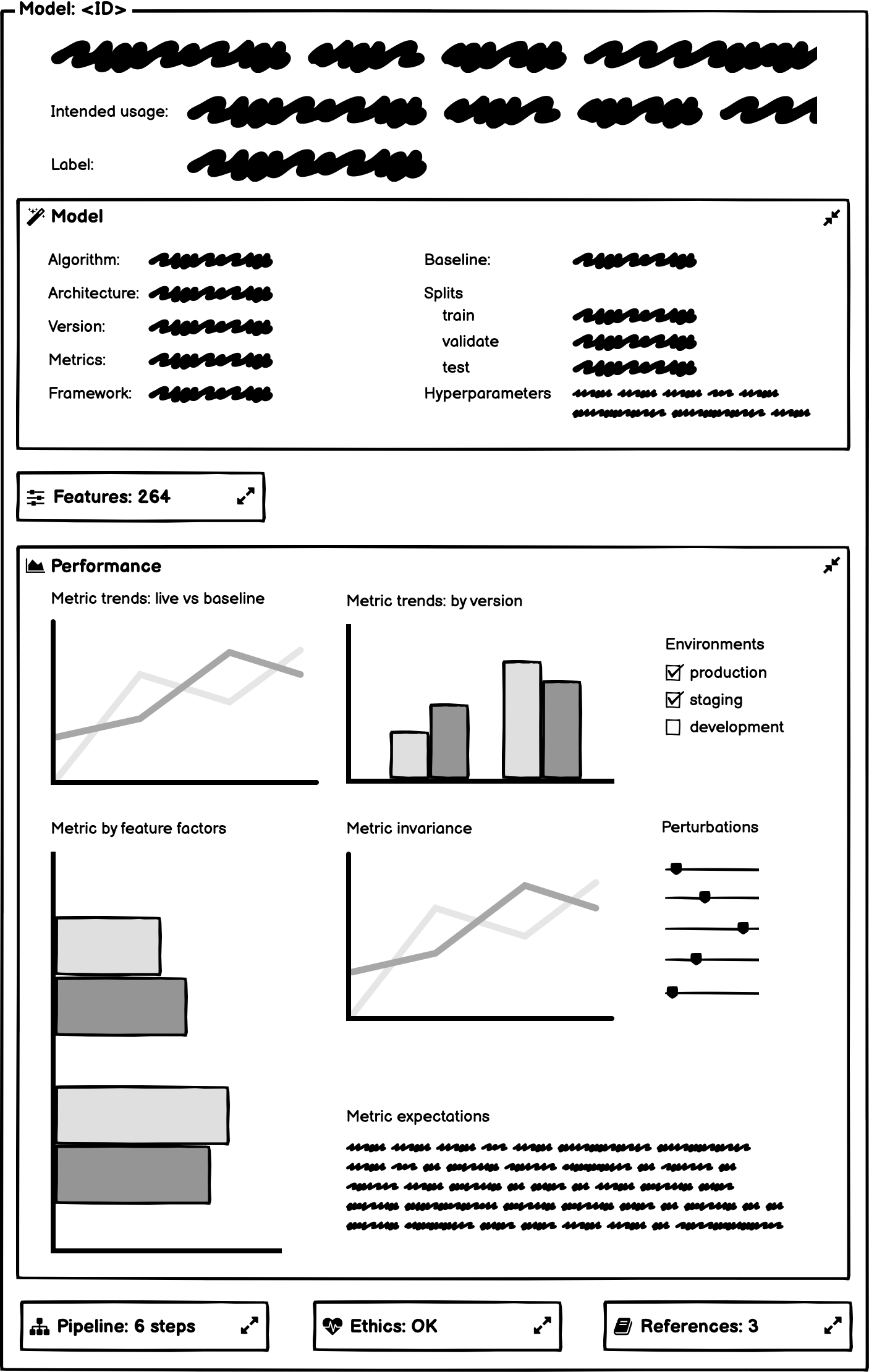
The label for supervised learning is explicitly listed, as are the features selected and their importance to the model.
Feature distributions across environments (e.g. production vs development) enable quick evaluations of whether features used during training are still representative of the data seen in production.
The time to live (TTL) is the maximum age for each feature value at the time of a point-in-time lookup. It is the time difference between the feature’s event timestamp and when it is queried. This ensures only fresh (versions of) features from the feature store are included.
The model performance metrics are not only shown over time to visualize model drift, but also by model version and against a baseline model. That baseline can either be a simpler model (e.g. heuristic) or a previous version of the current model. The live performance of the model, with or without a delay, is displayed as function of time too, but that may not always be possible. By further breaking down the model performance by feature factors, intersectional analyses of various social and demographic factors enable quick assessments of bias and fairness.
Metrics invariance is a means of testing the robustness of models to small changes (perturbations) in the features. Together with a description of expectations of the behaviour of the model (e.g. safety bounds on predictions a.k.a. guardrails), that takes care of the requirements specification and robustness, which together have the greatest impact on the performance of machine learning models.
The pipeline of the model consists of all steps between the feature ingestion and the model deployment. Decision thresholds define when a model is good enough to be pushed to staging or production, automatically or manually (i.e. with humans in the loop), which may be in any form supported by services. If the model is A/B-tested prior to roll-outs, there is a link to the experiment(s) with feature flag configurations.
The pipeline’s deployment section has space for custom routes (e.g. for multi-armed bandits), ensembles (i.e. where predictions of multiple models are combined to generate a single prediction), and prediction interpretations, if any, too.
Schedules for retraining or retuning may be different. These fall into three categories: continuous, triggered by either model decay or data shifts, or periodic. Shifts in data that affect the predictive qualities of ML models come in three guises: shifts in the independent variables (covariate shift), shifts in the target variable (prior probability shift), and shifts in the relationship between the independent and target variables (concept shift/drift).
Service Card
The service component card describes web and model prediction services as well as backend microservices:
- Identifier
- Description
- Endpoint
- Version
- SLAs or SLOs
- Link to API documentation
- API version
- Authentication
- Labels (if applicable)
- Metrics trends
- System level: CPU, RAM, GPU, I/O, network
- Service level: requests per second, slow requests, response time, execution time, error rate, cache hit ratio
- Deployment environment: development, staging, or production
- Deployment type: basic, rolling, blue/green, canary, or shadow
- Link to monitoring
- On-call rotation
Depending on the deployment infrastructure, labels and additional metrics may be relevant, such as pod restarts or scale up/down times. The last becomes relevant when traffic comes in extreme peaks.
The service score measures the overall health of the service, which can most easily be achieved by measuring breaches of the service level objectives.
Metric Card
Key performance indicators (KPIs) or metrics used for experimentation can be defined centrally too. This gives everyone in the company a common understanding of how important things are measured.
- Identifier
- Description
- Scope: business, business unit, or team
- Intended usage: business, reporting/operations, or experimentation
- Approval status
- Dimensions
- Link to dashboards
- Link to experiment(s) (if applicable)
If metrics are served through APIs as well as dashboards, links to both the service and any experiments allow for easy checking up on metrics. Any links to experiments in either the model or metric cards can easily be replaced with an experiments score, should we wish to extend our ML cards with an experiments component card.
Summary
ML cards offer a way to implement end-to-end governance of D/MLOps, which is an integrated approach to machine learning, from data through development to deployment. With an automated and standardized solution across teams and business units, high-value assets are assured to be governed appropriately, especially with the aid of check lists that reify best practices.