What Makes A New York Times Article Popular? (Part 1/2)
I completed the MITx course The Analytics Edge on edX, which I can wholeheartedly recommend to anyone who is interested in analytics. As a part of the MOOC, there was a competition on Kaggle to build a predictive model to answer the question, ‘What makes a New York Times blog article popular?’
Introduction
For those of you who are not familiar with Kaggle: Kaggle is a platform for data scientists to enter competitions, either for money, jobs, fun, or glory. The competitions are created by companies or researchers who provide the background details, research question, and the data. The aim is for the competitors to create the best possible predictive model.
In addition, Kaggle is a great way to gauge your skills against your peers, and — as I have learnt from this one particular challenge — quite addictive.
The Challenge
The New York Times offers both newspaper articles and blog posts. The newspaper articles are intended for subscribers, although anyone can read up to 10 articles per month for free. The blog posts are, as far as I can tell, for anyone who happens to browse by, which means that search engine optimization (SEO) is potentially an important factor in what becomes popular.
The problem was phrased as follows:
Many blog articles are published each day, and the New York Times has to decide which articles should be featured. In this competition, we challenge you to develop an analytics model that will help the New York Times understand the features of a blog post that make it popular.
Popular in this sense means that there are at least 25 comments in the online comments section of the blog article. The data consisted of a training data set of 6,532 posts and a test set of 1,870 articles. The training set’s articles ran from September to November 2014, and the test set had posts from December of the same year. An obvious difficulty was that the test set contained articles pertaining to Christmas, whereas such posts were absent from the training set.
Anyway, the variables included in the data set were as follows:
-
NewsDesk, the news desk that produced the article; -
SectionName, the section in which the article was published; -
SubsectionName, the subsection in which the article was published; -
Headline, the title of the article; -
Snippet, an excerpt of the article; -
Abstract, a summary of the article; -
WordCount, the number of words in the article; -
PubDate, the publication date; -
UniqueID, a unique identifier.
UniqueID was obviously only included for the predictions and was not relevant to the model itself.
The solution I created landed me on the 97th spot out of 2,923, so well within the top 5% on the public leader board. Privately, I came in in place 298, so just outside the top 10% of all submissions. What the difference tells me is that my predictive model suffered from overfitting — bummer. Nevertheless, I believe that my ideas and mistakes may be valuable to others, which is why I have included them here. Moreover, many of the submissions posted on the forums only show the bare-bones of the models: the code necessary to recreate the successful entries. I am a strong believer that whatever you include in your model should be falsifiable, which is what (data) science is all about. For instance, if a feature happens to bump your AUC, that’s nice, but without verifying that popular and unpopular articles really do behave differently with regard to that particular feature it may just be a fluke. When there is a statistical basis for a feature, the model will only confirm that. So, take the time to check the statistics.
After finishing the competition I came across an interview with Marios Michailidis, the current number-two Kaggler in the world, who finished 25th and 37th on the public and private leader boards, respectively. His iteration cycle contains a piece of advice that I want to repeat because I only took a deeper look after I had created a few submissions, which eventually cost me a lot of time and caused me to lose interest just before I had a mental breakthrough: “sacrifice a couple of submissions […] to understand the importance of the different algorithms.” I shall add to that to take the time to understand the problem well.
Background Information
Before doing anything with the data it may be beneficial to look at the New York Times’ blog directory. Although it is quite possible that the structure has changed over the past few months, it will still be good enough to get a feel of what is available. The directory is structured as follows — I have copy-pasted and edited the descriptions slightly:
- News and Politics
- Sinosphere: dispatches from China.
- FirstDraft: fast-paced and comprehensive coverage of politics and elections.
- City Room: news and regular features, including Q&A’s, about New York.
- At War: insight and images from Afghanistan, Pakistan and Iraq in the post-9/11 era.
- Lens: visual and multimedia reporting.
- Business and Finance
- DealBook: the latest news and deals on Wall Street.
- You’re the Boss: where small-business owners get news, ask questions and learn from one another’s mistakes.
- Technology
- Bits: news and analysis on the technology industry.
- Open: a blog about code and development.
- Culture and Media
- ArtsBeat: from the culture desk, up-to-the-minute reports from ars and entertainment.
- After Deadline: notes from the newsroom on grammar, usage and style.
- Public Editor’s Journal: a blog by Margaret Sullivan, the readers’ representative.
- Carpetbagger: Cara Buckley is your re carpet guide to the news and the nonsense of awards season.
- Health, Family and Education
- Well: Tara Parker-Pope reports on medical science, nutrition, fitness and family health.
- Motherlode: subjects […] related to parenting.
- The New Old Age: a focus on the elderly and the adult children who struggle to care for them.
- The Learning Network: teaching and learning, with The New York Times as a resource.
- Styles, Travel and Leisure
- The Moment: spanning the universe of fashion, design, food, travel and culture.
- In Transit: the travel desk offers news, city guides and consumer deals.
- On the Runway: fashion news and commentary.
- Wordplay: all about The Times’ crossword puzzle, constructors and clues.
- IHT Retrospective: highlights from The International Herald Tribune’s storied reportage.
- Magazines
- The 6th Floor: the blog that eavesdrops on The News York Times Magazine.
- Abstract Sunday: Christoph Niemann’s illustrated reflections of life.
- The Moment: spanning the universe of fashion, design, food, travel and culture.
- Opinion
- Opinionator: exclusive commentary on politics, law, science, finance and more.
- Taking Note: political commentary.
- Dot Earth: Andrew C. Revkin on climate change and the environment.
- Op-Ed columnists.
Interestingly, The Moment appears in both Styles, Travel and Leisure and Magazines, although it really belongs to the latter. The hyperlink in both cases reads ‘Read T Magazine’.
We can also dig deeper and look at the list of available subsections:
-
Business Day
- International
- Dealbook
- Markets
- Economy
- Energy
- Media
- Technology
- Personal Tech
- Small Business
- Your Money
- DealBook
- Mergers & Acquisitions
- Investment Banking
- Private Equity
- Hedge Funds
- I.P.O./Offerings
- Venture Capital
- Legal/Regulatory
- Bits
- Mobile
- Privacy
- Security
- Big Data
- Cloud Computing
- The Learning Network
- News Quiz
- Word of the Day
- On This Day in History
- Student Crossword
- Ideas From Readers
- Skills Practice
- NYTLNreads
- 6 Q’s About the News
- Text to Text
- Test Yourself Questions
- Teach Any NYT
- Poetry Pairings
- Teenagers in The Times
- What’s Going On In This Picture?
- Throwback Thursday
- Student Contests
- The Moment
- Women’s Fashion
- Men’s Fashion
- Design
- Travel
- Food
- Culture
- Video
What Makes Certain Blog Posts Popular?
I tried to scrounge the net for some information on what makes some blog posts more popular than others. Even though what constitutes ‘popular’ varies from person to person (e.g. the number of comments, the number of clicks, the number of shares, and so on), some general characteristics can be found:
- Use numbers in titles.
- Use a list as a blog post.
- Ask a question or write a ‘How to…’.
- Use unique instead of common adjectives.
- Use 65 characters or fewer to avoid title truncation in search results.
- Use 6 words for the headline, although that number is contested.
- Use negative wording (e.g. ‘no’, ‘without’, ‘worst’, ‘never’, and ‘stop’).
Sarah Goliger has written an excellent list of variations of what works best for blog titles.
Moreover, 8 out of 10 people will read the headline but only 2 out of 10 will read the rest. Whether that is also applicable to the readers of The New York Times is unclear, but it does show that the headline is most important in grabbing people’s attention.
Exploratory Data Analysis
The course focused on analytics with R, so I shall use R code in what follows.
First, let’s import the data from the present working directory, and create a single data frame called News:
libs = c("ggplot2", "tm", "SnowballC", "randomForest", "caret", "reshape", "psych", "topicmodels", "RWeka")
lapply(libs, require, character.only=TRUE)

NewsTrain = read.csv("NYTimesBlogTrain.csv", stringsAsFactors=FALSE)
NewsTest  = read.csv("NYTimesBlogTest.csv", stringsAsFactors=FALSE)

NewsTest$Popular = NA
News             = rbind(NewsTrain, NewsTest)
Why create a single data frame when we need to have it split anyway?
Well, whenever we manipulate the data, the training and test set may get ‘out of sync’.
For instance, if we issue an as.factor(...) and a particular factor (i.e. label) does not appear in either one of the data sets, some of the predictive modelling functions complain that the factors do not line up.
This can easily be fixed by doing all the work on one data set, and then splitting it as follows:
NewsTrain = head(News, nrow(NewsTrain))
NewsTest  = tail(News, nrow(NewsTest))
To anyone familiar with the course, the last three libraries may seem odd. psych is needed to calculate the trace of a matrix, which I have used a lot to compute the accuracy from a confusion matrix; the trace is nothing but the sum of the entries on the diagonal.
The package topicmodels is needed for Latent Dirichlet Allocation (LDA), which is a technique to generate topics from a document-term matrix.
My best model did not use LDA, but in Part 2 I want show you how it works anyway, as I played with it a while.
RWeka is an option to calculate n-grams by means of a tokenizer that can be supplied to the DocumentTermMatrix (or TermDocumentMatrix) function of tm.
The reason I want to do is that I wish to see combinations of words that appear frequently on top of single words.
This can be accomplished with n-grams.
Popularity
So, how many blog articles are popular?
table(News$Popular)
The table function ignores NA (not available), so we really only see the data from the training set.
What we see is that 1,093 articles in the training set are popular and 5,439 are not.
So fewer than 16.7% of all NYT blog articles have more than 25 comments.
A simple baseline model would be to always predict that an article will be unpopular. On the training set, the accuracy would be 83.2%. Not bad, but we can definitely do better.
In fact, the staff of the edX course also provided two simple models: a logistic model that only looked at WordCount as a predictor (i.e. independent variable), and a simple bag-of-words model that looked at Headline and WordCount.
The AUC values on 60% of the test set (i.e. the data set for the public leader board) for these models were 0.69608 and 0.74706, respectively.
The corpus had a sparsity of 99%, so the model only considered the top 1% of all terms in the document-term matrix.
When running the logistic classifier, R warned about the fact that fitted probabilities numerically 0 or 1 occurred, which is usually a good indicator of overfitting.
Snippet vs Abstract
By looking at the data, it quickly became clear that Snippet and Abstract were very similar.
A simple one-liner confirmed my suspicions:
length(which(News$Snippet==News$Abstract))
8,273 (out of 8,402) snippets are equal to the abstract.
When we look at the cases where Snippet != Abstract, we see that the snippet is often a substring of the abstract with ellipses at the end:
nCharSnippet = nchar(News$Snippet)
idx          = which(substr(News$Snippet, 1, nCharSnippet - 3) != substr(News$Abstract, 1, nCharSnippet - 3))
News$Abstract[idx]
News$Snippet[idx]
Alternatively, you can issue News[idx, 5:6] and get the data in one command.
What we see is that there are three articles for which the snippet does not end in ellipsis.
Instead, they have a blank abstract and a snippet that reads "[Photo: View on Instagram.]".
There is also one blank abstract with a non-blank snippet.
Furthermore, some articles have an abstract with HTML code inside, which the snippet does not have.
To remove HTML we can create a simple function that strips off HTML tags, as they are unlikely to make an article popular:
# Remove leading and training white space
trim = function(str) {
  return(gsub("^s+|s+$", "", str))
}

# Remove diacritics from letters
replaceHTML = function(str) {
  return(gsub("&([[:alpha:]])(acute|cedil|circ|grave|uml);", "1", str))
}

# Remove special characters, such as dashes, quotes, and ellipses
ignoreHTML = function(str) {
  return(gsub("&((m|n)dash|hellip|(l|r)squo;)", "", str))
}

# Extract the text between HTML tags
extractText = function(str) {
  return(gsub("<.*?>", "", str))
}

# Clean up: extract, remove, replace, and trim
cleanupText = function(str) {
  return(trim(replaceHTML(ignoreHTML(extractText(str)))))
}
We can thus create a new variable called Summary, just in case we want to use the tags later on, that is equal to Abstract modulo HTML tags.
Furthermore, we can take the more informative (i.e. longer) of Snippet and Abstract and put it in Summary:
News$Summary = ifelse(nchar(cleanupText(News$Snippet)) > nchar(cleanupText(News$Abstract)),
                      cleanupText(News$Snippet),
                      cleanupText(News$Abstract))
Another thing we can do is replace commonly observed combinations of words, especially ‘New York Times’, ‘New York City’, and ‘New York’. There are mainly two reasons to do this:
- The word ‘new’ is often a stopword to be removed in the creation of a corpus, so that we end up with ‘York’, which may or may not refer to ‘New York’ (USA) or ‘York’ (UK).
- When we compute n-grams ‘York’ will show up more often but it will show up in both ‘New York Times’ and ‘New York City’, which means we may be overcounting the contribution of ‘York’.
As such, we create two vectors with the original text and the replacement text:
originalText    = c("new york times", "new york city", "new york", "silicon valley", "times insider",
                    "fashion week", "white house", "international herald tribune archive", "president obama", "hong kong",
                    "big data", "golden globe")
replacementText = c("NYT", "NYC", "NewYork", "SiliconValley", "TimesInsider",
                    "FashionWeek", "WhiteHouse", "IHT", "Obama", "HongKong",
                    "BigData", "GoldenGlobe")
The vectors contain a few more entries based on manual inspection of the data available.
To replace the entries of originalText with replacementText we can use a multi-gsub function:
mgsub = function(x, pattern, replacement, ...) {
  if (length(pattern) != length(replacement)) {
    stop("pattern and replacement do not have the same length.")
  }
  result = x
  for (i in 1:length(pattern)) {
    result = gsub(pattern[i], replacement[i], result, ...)
  }
  return(result)
}

News$Headline = mgsub(News$Headline, originalText, replacementText, ignore.case=TRUE)
News$Summary  = mgsub(News$Summary,  originalText, replacementText, ignore.case=TRUE)
The ellipsis ... indicates that we can supply gsub-specific parameters to the mgsub function and they are passed to each call to gsub.
An example is ignore.case, as shown in the code.
Before proceeding, let’s combine the headline and the summary, so it’s easier to search for certain terms in either field:
News$Text = paste(News$Headline, News$Summary)
Missing Categories
The categorical variables are available that group articles into topical buckets: NewsDesk, SectionName, and SubsectionName.
The list of possible sections is (likely) based on the navigation links at the top of the blog directory page:
- World
- U.S.
- N.Y. / Region
- Business
- Technology
- Science
- Health
- Sports
- Opinion
- Arts
- Style
- Travel
Unfortunately, few blog posts have all three filled in.
NoCat = subset(News, News$NewsDesk=="" | News$SectionName=="" | News$SubsectionName=="")
dim(NoCat)
The last command informs us that 6,721 articles have at least one absent category.
If we replace the | (or) with & (and), we find 1,626 articles for which we have no categories at all.
Since the amount of unavailable categories is so large, we cannot expect multiple imputation (e.g. with the mice package) to yield stellar results.
What this calls for is manual intervention, or more accurately: data cleansing.
Filling In NewsDesk
We can easily see the common combinations, sorted by SectionName:
CatMap        = as.data.frame(table(News$NewsDesk, News$SectionName, News$SubsectionName))
names(CatMap) = c("NewsDesk", "SectionName", "SubsectionName", "Freq")
CatMap        = subset(CatMap, Freq > 0)
CatMap[order(CatMap$SectionName), ]
     NewsDesk      SectionName    SubsectionName Freq
1                                                1626
2    Business                                       6
3     Culture                                      71
4     Foreign                                     209
7    National                                       2
8        OpEd                                      19
9     Science                                       4
10     Sports                                       1
11     Styles                                     132
13     TStyle                                     829
14                        Arts                     11
16    Culture             Arts                    838
443               Business Day          Dealbook   13
444  Business     Business Day          Dealbook 1243
1483              Business Day    Small Business    5
1484 Business     Business Day    Small Business  176
40            Crosswords/Games                      5
41   Business Crosswords/Games                    160
53                      Health                      1
61    Science           Health                    247
63     Styles           Health                      1
70   Magazine         Magazine                     34
79                  Multimedia                    193
92               N.Y. / Region                      3
97      Metro    N.Y. / Region                    262
105                       Open                      5
118                    Opinion                     10
125      OpEd          Opinion                    661
1366                   Opinion   Room For Debate   82
1782                   Opinion The Public Editor   30
140    Sports           Sports                      1
986    Styles            Style   Fashion & Style    2
157                 Technology                      1
158  Business       Technology                    441
170                     Travel                      5
181    Travel           Travel                    147
183                       U.S.                      3
193    Styles             U.S.                    238
807                       U.S.         Education  414
1229 National             U.S.          Politics    2
199   Foreign            World                     10
404                      World      Asia Pacific    1
407   Foreign            World      Asia Pacific  258
This table allows us to not only (literally) fill in the blanks but also to overwrite what may seem illogical or perhaps even downright wrong.
However, let’s not get carried away and fill in the blanks for NewsDesk based on the most common values of SectionName:
News$NewsDesk = ifelse(News$NewsDesk=="" & News$SectionName=="Arts", "Culture", News$NewsDesk)
News$NewsDesk = ifelse(News$NewsDesk=="" & News$SectionName=="Business Day", "Business", News$NewsDesk)
News$NewsDesk = ifelse(News$NewsDesk=="" & News$SectionName=="Health", "Science", News$NewsDesk)
News$NewsDesk = ifelse(News$NewsDesk=="" & News$SectionName=="Multimedia", "", News$NewsDesk)
News$NewsDesk = ifelse(News$NewsDesk=="" & News$SectionName=="N.Y. / Region", "Metro", News$NewsDesk)
News$NewsDesk = ifelse(News$NewsDesk=="" & News$SectionName=="Open", "Technology", News$NewsDesk)
News$NewsDesk = ifelse(News$NewsDesk=="" & News$SectionName=="Opinion", "OpEd", News$NewsDesk)
News$NewsDesk = ifelse(News$NewsDesk=="" & News$SectionName=="Technology", "Business", News$NewsDesk)
News$NewsDesk = ifelse(News$NewsDesk=="" & News$SectionName=="Travel", "Travel", News$NewsDesk)
News$NewsDesk = ifelse(News$NewsDesk=="" & News$SectionName=="U.S.", "National", News$NewsDesk)
News$NewsDesk = ifelse(News$NewsDesk=="" & News$SectionName=="World", "Foreign", News$NewsDesk)
Crosswords/Games appears underneath Business, which seems a tad peculiar, especially since Wordplay belongs to the category Styles, Travel and Leisure. Let’s fix that:
idx = which(News$SectionName=="Crosswords/Games")
News$NewsDesk[idx]       = "Styles"
News$SectionName[idx]    = "Puzzles"
News$SubsectionName[idx] = ""
Another obvious candidate for a reclassification is the section U.S. for the news desk Styles.
idx = which(News$NewsDesk=="Styles" & News$SectionName=="U.S.")
News$NewsDesk[idx]       = "Styles"
News$SectionName[idx]    = "Style"
News$SubsectionName[idx] = ""
Some recurring topics appear in the list, such as Charities That Inspire Kids, Quandary, Weekly Quandary, and Your Turn: A Weekend Thread, Open for Comments.
We can easily identify these out by running sort(News$Text[idx]).
In fact, quite a few headlines (37.3%) refer to topics regarding children, parenting, school and/or family:
table(grepl("child|kid|parent|school|mother|father|family|teenager", News$Headline[idx], ignore.case=TRUE))
Filling In SectionName
We can change the order of the NoCat data frame to identify sections that we can easily fill in:
CatMap[order(CatMap$NewsDesk), ]
What we end up with is the following sequence of commands:
News$SectionName = ifelse(News$SectionName=="" & News$NewsDesk=="Culture", "Arts", News$SectionName)
News$SectionName = ifelse(News$SectionName=="" & News$NewsDesk=="Foreign", "World", News$SectionName)
News$SectionName = ifelse(News$SectionName=="" & News$NewsDesk=="National", "U.S.", News$SectionName)
News$SectionName = ifelse(News$SectionName=="" & News$NewsDesk=="OpEd", "Opinion", News$SectionName)
News$SectionName = ifelse(News$SectionName=="" & News$NewsDesk=="Science", "Science", News$SectionName)
News$SectionName = ifelse(News$SectionName=="" & News$NewsDesk=="Sports", "Sports", News$SectionName)
News$SectionName = ifelse(News$SectionName=="" & News$NewsDesk=="Styles", "Style", News$SectionName)
News$SectionName = ifelse(News$SectionName=="" & News$NewsDesk=="TStyle", "Magazine", News$SectionName)
The last entry is based on the fact that the NYT magazine is called T Magazine and covers style in the broadest sense of the word.
Filling In SubsectionName
The subsection is a bit more tricky because a) we have few entries populated, b) it depends on the contents, and c) some sections do not have any subsections, while others do.
Moreover, when adding many subsections we make it more difficult for algorithms like random forests to find the best (local) split.
Categorical predictors with $N$ distinct values (i.e. levels in R parlance) have $2^N1$ possible combinations: a yes/no decision for each level.
When $N ≫ 1$ it quickly becomes infeasible.
I actually wasted quite a bit of time filling in the SubsectionName only to find out that the random forest classifier could not really benefit from my efforts.
What is more, R’s implementation of random forests does not permit more than 32 levels. It is possible to make the categorical predictor ordinal or split the categorical variables but that is tedious. Random forests with categorical predictors with various levels can be biased towards attributes with more levels.
Apart from that, we may miss out on interactions among topics. For instance, consider the following mock headline:
President Obama Signs Off On Education Benefits Bill For Children Of Disabled Veterans
The article is likely to be related to national politics and eduction, but disabilities (or health in general) and the military (or at least veterans) are not far off the mark either. If we toss this article into the Politics bucket, we miss out on the goodies that the headline provides; ‘disabled’ and ‘veterans’ are unlikely to show up in too many posts, which means that a bag-of-words model may not capture these features. Furthermore, we can easily see that the appearance of ‘Obama’ in the headline gives the article a 19% probability that it will become popular:
analyseTerms = function(terms, ignoreCase=TRUE)
{
  idxHeadTrain = which(grepl(terms, NewsTrain$Headline, ignore.case=ignoreCase))
  idxTextTrain = which(grepl(terms, NewsTrain$Text,     ignore.case=ignoreCase))
  idxHeadTest  = which(grepl(terms, NewsTest$Headline,  ignore.case=ignoreCase))
  idxTextTest  = which(grepl(terms, NewsTest$Text,      ignore.case=ignoreCase))

  avgPopHeadTrain = mean(as.numeric(as.character(NewsTrain$Popular[idxHeadTrain])))
  numArtHeadTrain = length(idxHeadTrain)
  avgPopTextTrain = mean(as.numeric(as.character(NewsTrain$Popular[idxTextTrain])))
  numArtTextTrain = length(idxTextTrain)
  numArtHeadTest  = length(idxHeadTest)
  numArtTextTest  = length(idxTextTest)

  return(c(avgPopHeadTrain, numArtHeadTrain,
           avgPopTextTrain, numArtTextTrain,
           numArtHeadTest, numArtTextTest))
}

analyseTerms("obama")
We also see that there are 45 articles in the test set that have ‘Obama’ in the headline.
The function analyseTerms looks at the popularity in both Headline and Text and returns in order:
- the mean popularity of the term specified in the headlines of the training set;
- the number of articles with the term specified in the headlines of the training set;
- the mean popularity of the term specified in the texts (i.e. the concatenation of the headline and the summary) of the training set;
- the number of articles with the term specified in the texts of the training set;
- the number of articles with the term specified in the headlines of the test set;
- the number of articles with the term specified in the texts of the test set.
The as.numeric(as.character(...)) conversion is necessary when we have specified the Popular variable as a factor, which we’ll do later on.
It ensures that the function will still work as intended.
Speaking of President Obama, politics is not really represented well in the categories. There are a few sections that definitely belong to politics, such as ‘First Draft’.
idx = which(News$NewsDesk=="" & News$SectionName=="" & News$SubsectionName=="" &
              grepl("^(first draft|lunchtime laughs|politics helpline|today in politics|verbatim)",
                    News$Headline, ignore.case=TRUE))
News$NewsDesk[idx] = "National"
News$SectionName[idx] = "U.S."
News$SubsectionName[idx] = "Politics"
Beyond that, we can search for political terms:
idx = which(News$SectionName=="" &
              grepl(paste0("white house|democrat|republican|tea party|",
                           "obama|biden|boehner|kerry|capitol|senat|",
                           "sen.|congress|president|washington|politic|",
                           "rubio|palin|clinton|bush|limbaugh|rand paul|",
                           "christie|mccain|election|poll|cruz|constitution|",
                           "amendment|federal|partisan|yellen|govern|",
                           "gov.|legislat|supreme court|campaign|",
                           "primary|primaries|justice|jury"),
                    News$Text, ignore.case=TRUE))
News$NewsDesk[idx]       = "National"
News$SectionName[idx]    = "U.S."
News$SubsectionName[idx] = "Politics"

idx = which(News$SectionName=="" &
              grepl(paste0("PAC|GOP|G.O.P.|NRA|N.R.A."),
                    News$Text, ignore.case=FALSE))
News$NewsDesk[idx]       = "National"
News$SectionName[idx]    = "U.S."
News$SubsectionName[idx] = "Politics"
Some of these terms cannot be used in general, as it is unlikely that people will talk about John Boehner years from now. Similarly, Sarah Palin and Rush Limbaugh have a sell-by date, at least we can but hope.
Please observe that I used ‘politic’ as a search term, so that ‘politics’, ‘politician(s)’, and ‘political’ are caught in our grepl net.
I did specify ‘Rand Paul’ instead of just ‘Paul’ because the latter is too broad a term to be useful; many men are named Paul, even (former) popes.
Moreover, we search not just the headline but also the summary (i.e. abstract), so that we group together many more articles that have a political flavour.
Filling In The Rest
To see statistics for the missing entries when we run table(), we can simply add in a category Missing:
News$NewsDesk[which(News$NewsDesk=="")]             = "Missing"
News$SectionName[which(News$SectionName=="")]       = "Missing"
News$SubsectionName[which(News$SubsectionName=="")] = "Missing"
Random forests (with the randomForest) do not handle missing values in predictors, so either we have to resort to another implementation that does handle NAs or impute the missing values.
Publication Date
The publication date can be used to create new features, such as the workday and the hour of publication.
News$PubDate           = strptime(News$PubDate, "%Y-%m-%d %H:%M:%S")
News$PubDay            = as.Date(News$PubDate)
News$Weekday           = News$PubDate$wday
News$Hour              = News$PubDate$hour
We may expect different behaviours at different times of the day.publication
Character and Word Lengths
From the sample models it is clear that the word count of the articles is an important factor in determining whether an articles becomes popular or not. We can examine this in more detail by comparing the word counts of popular and unpopular posts:
News$HeadlineCharCount = nchar(News$Headline)
News$SummaryCharCount  = nchar(News$Summary)
News$HeadlineWordCount = sapply(gregexpr("W+", gsub("[[:punct:]]", "", News$Headline)), length) + 1
News$SummaryWordCount  = sapply(gregexpr("W+", gsub("[[:punct:]]", "", News$Summary)),  length) + 1
The word count for the articles itself is not the only metric we have, and in fact we can construct our own by looking at the headline and summary too.
From looking at the histogram we see that most articles have 2,000 words or fewer and that the majority has even fewer than 1,000. A transformation may be in order:
News$NewsDesk       = as.factor(News$NewsDesk)
News$SectionName    = as.factor(News$SectionName)
News$SubsectionName = as.factor(News$SubsectionName)
News$Popular        = as.factor(News$Popular)
News$LogWC          = log(1 + News$WordCount)
We can now look at whether the distribution of LogWC is different for popular and unpopular news items:
ggplot(NewsTrain, aes(x=LogWC, fill=Popular)) +
  geom_density(aes(y=..scaled..), alpha=0.4) +
  ggtitle("Distribution of LogWC") +
  xlab("log(1 + WordCount)") +
  theme(axis.title.y = element_blank())
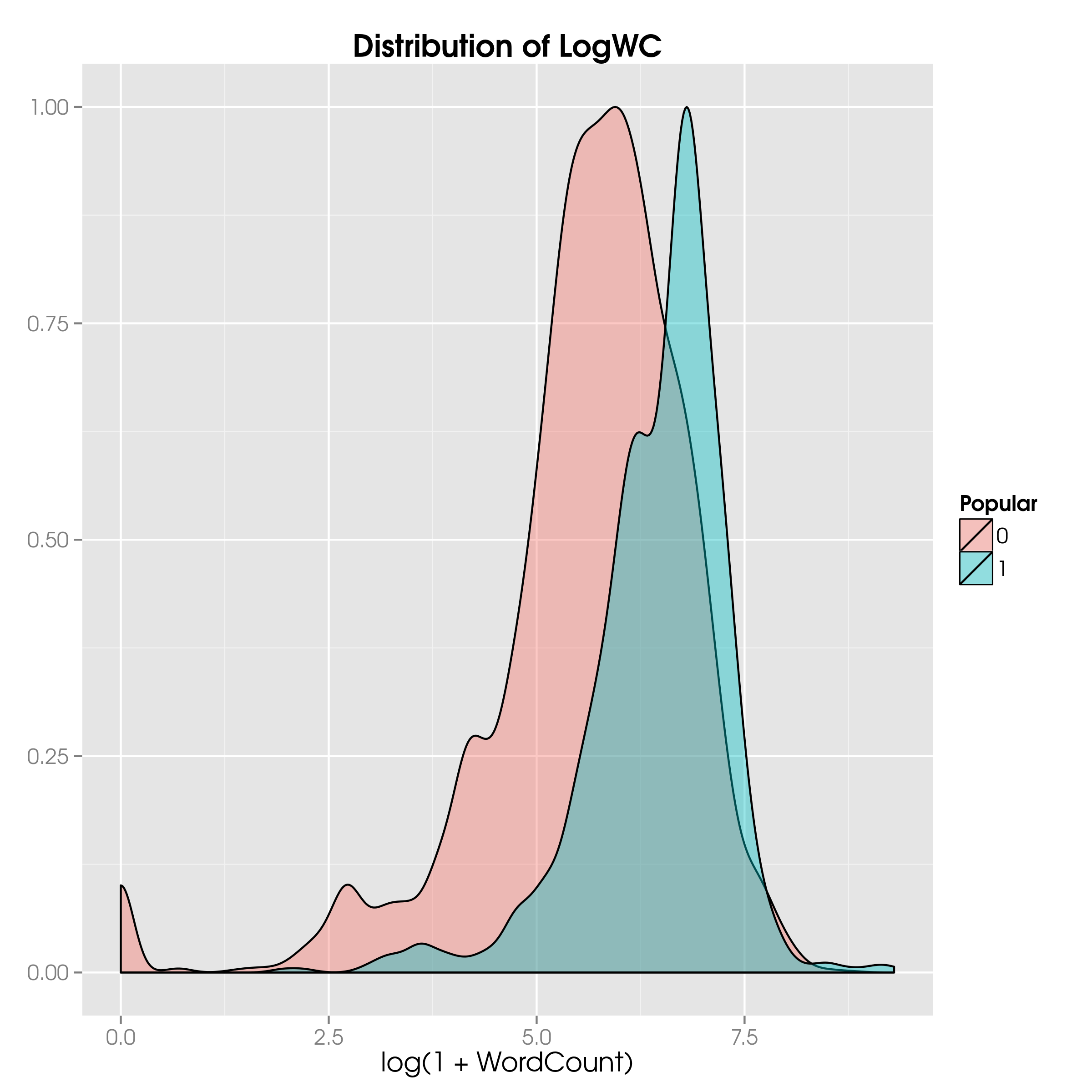
LogWCThey do look different, but let’s make sure with a two-sided t-test on the mean and a two-sided F-test on the variance:
PopularNewsTrain   = subset(NewsTrain, NewsTrain$Popular==1)
UnpopularNewsTrain = subset(NewsTrain, NewsTrain$Popular==0)

t.test(PopularNewsTrain$LogWC, UnpopularNewsTrain$LogWC)
var.test(PopularNewsTrain$LogWC, UnpopularNewsTrain$LogWC)
What the output tells us is that both the means and the variances are different at the (default) 95% confidence level. This shows us the rationale for including the word count, or rather the corresponding transformed variable: there is a statistically significant difference between popular and unpopular articles based on the word counts.
Is there a difference in the popularity of a blog post based on the day of the week? Let’s look:
News$DayOfWeek = as.factor(weekdays(News$PubDate))
News$DayOfWeek = factor(News$DayOfWeek, levels=c("Monday", "Tuesday", "Wednesday", "Thursday", "Friday", "Saturday", "Sunday"))

ggplot(NewsTrain, aes(x=LogWC, fill=Popular)) +
  geom_density(aes(y=..scaled..), alpha=0.4) +
  ggtitle("Distribution of LogWC") +
  xlab("Log(1 + WordCount)") +
  theme(axis.title.y = element_blank()) +
  facet_wrap( ~ DayOfWeek, ncol=1)
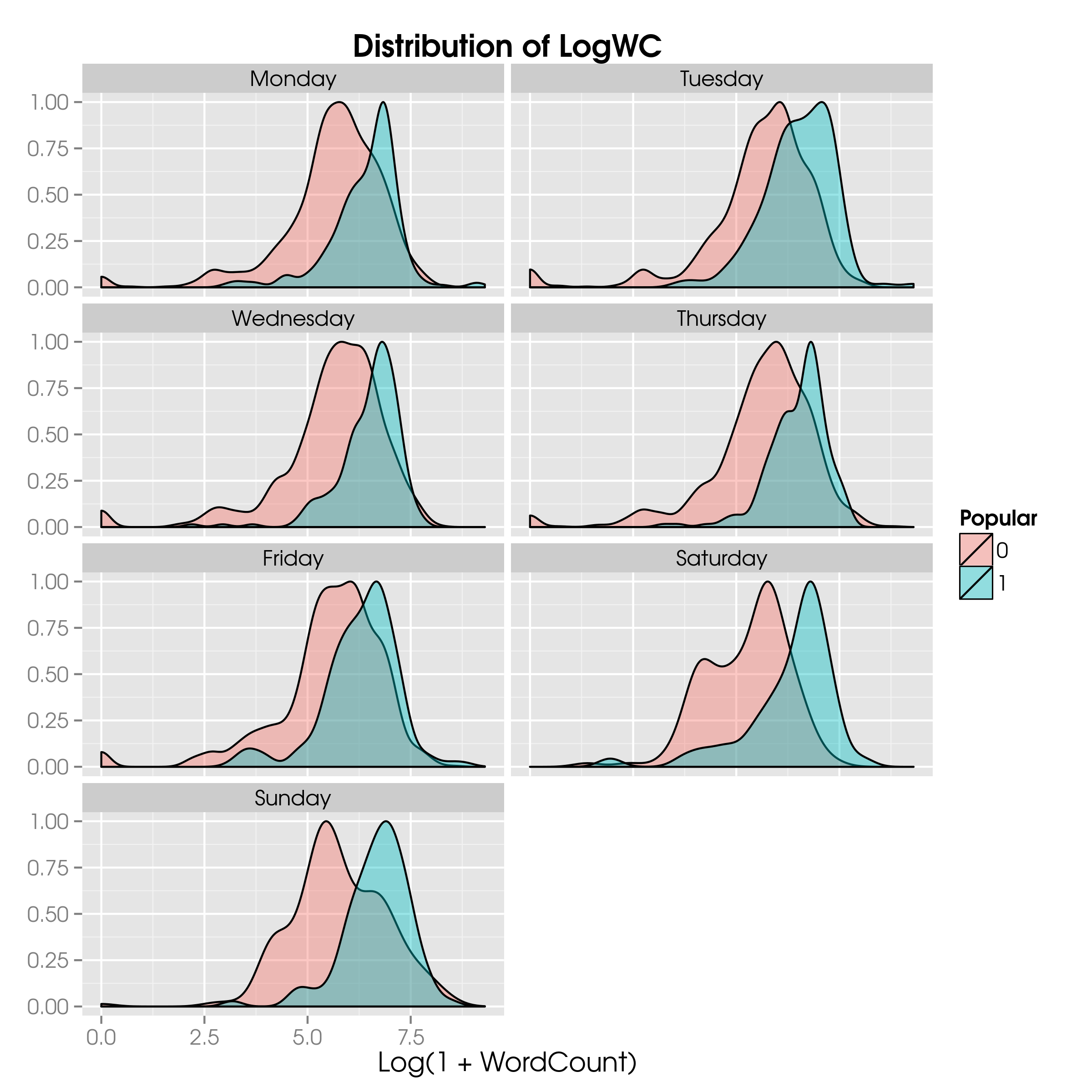
LogWC by dayWhat we see is that there does not seem to be a huge difference in the day-to-day distributions; Tuesday and Saturday long reads have a higher probability of becoming popular.
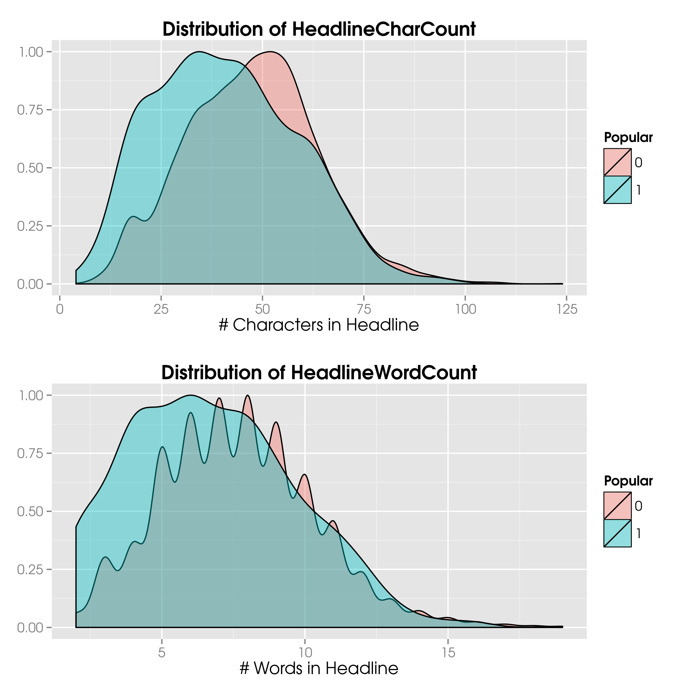
We can do a similar exercise with the character and word counts of both the headline and the summary:
News$HeadlineCharCount = nchar(News$Headline)
News$SummaryCharCount  = nchar(News$Summary)

News$HeadlineWordCount = sapply(gregexpr("\\W+", gsub("[[:punct:]]", "", News$Headline)), length) + 1
News$SummaryWordCount  = sapply(gregexpr("\\W+", gsub("[[:punct:]]", "", News$Summary)), length) + 1
SEO is the reason we investigate the character counts. Since the cut-off for search engines lies at 65 characters, we expect fewer popular articles with longer headlines.
ggplot(NewsTrain, aes(x=HeadlineCharCount, fill=Popular)) +
  geom_density(aes(y=..scaled..), alpha=0.4) +
  ggtitle("Distribution of HeadlineCharCount") +
  xlab("# Characters in Headline") +
  theme(axis.title.y = element_blank())

ggplot(NewsTrain, aes(x=HeadlineWordCount, fill=Popular)) +
  geom_density(aes(y=..scaled..), alpha=0.4) +
  ggtitle("Distribution of HeadlineWordCount")
  xlab("# Words in Headline") +
  theme(axis.title.y = element_blank())
What we infer from the statistical tests and the histograms is that popular articles tend to have fewer characters in the headline: 41 vs 48.
Consequently, the number of words in the headline is lower: 6.8 vs 7.8.
Note that the mean number of characters for both popular and unpopular articles is below the 65-character limit.
We can click on a random blog post and see that the title tag is the headline with ‘ - NYTimes.com’ (14 characters) appended.
Hence, most articles headlines will be visible in their entirety on search results, as $65 - 14 = 51 > 48$.
Timing
When people sleep it is unlikely that many articles will receive more than 25 comments.
Hence, at certain times during the day, we expect the probability that a random article becomes popular to be smaller.
Similarly, the day of the week may have an impact: on weekends people have more time to comment on blog posts.
Thankfully, News$PubDate has all the information we need.
A simple table(News$Popular, News$Weekday) suffices to see the trends.
What R tells us is that on Sundays (i.e. Weekday==0) there are 212 unpopular articles and 100 popular ones.
So, the probability of a random article published on a Sunday to become popular is about one third.
On Saturdays, the probability is around 0.27, so slightly lower.
Weekday blog posts are far more common but the popularity probability drops to approximately 0.15.
We can do the same exercise for the hour of day:
hourMatrix = as.matrix(table(News$Hour, News$Popular))
hourMatrix = cbind(hourMatrix, hourMatrix[, 2]/(hourMatrix[, 1] + hourMatrix[, 2]))
colnames(hourMatrix) = c("Unpopular", "Popular", "PopularDensity")
What we see is that the density of popular articles increases throughout the day from about 4AM onwards, at which time it is the lowest (0.01). During the day it peaks around 3PM with a ratio of approximately 0.21. From 7PM there is a slight jump to 0.27. Articles posted at 10PM have the highest probability of receiving many comments; nearly 60% of articles posted are popular.
All in all, we see clear patterns, so we may be confident that News$Hour and News$Weekday will have an impact on the predictive model that we shall build.
Articles Per Day
When many articles are published on any given day, the opportunity for people to comment on individual articles increases but overall they may not be able to comment on many more than when there are fewer articles. So, we expect there to be a sweet spot, where the number of articles published is optimal for the popularity on a given day.
A simple call to table(...) will give us the number of articles per day (i.e. News$PubDay), so that we can join the information back into the News data frame:
DailyArticles        = as.data.frame(table(News$PubDay))
names(DailyArticles) = c("PubDay", "NumDailyArticles")
News                 = merge(News, DailyArticles, all.x=TRUE)
Note that we are performing a LEFT JOIN (in SQL parlance), as x refers to the data frame specified first, and we have set all.x to true.
We can now run the following simple command and see the number of articles per day and its effect on the popularity: table(News$Popular, News$NumDailyArticles).
Although the output is usable, it’s not exactly visually appealing.
So, let’s plot the distributions for popular and unpopular articles:
News$Pop = as.numeric(as.character(News$Popular))
News$Pop[which(is.na(News$Popular))] = "N/A"
News$Pop = as.factor(News$Popular)

ggplot(News, aes(x=NumDailyArticles, fill=Pop)) +
  geom_density(aes(y=..scaled..), alpha=0.4) +
  ggtitle("Distribution of NumDailyArticles") +
  xlab("# Daily Articles Published") +
  scale_fill_discrete(name="Popular") +
  theme(axis.title.y = element_blank())
For this chart I have included the N/As too, as they show quite some interesting stuff; we can simply replace News with NewsTrain to see the distribution without the N/As.
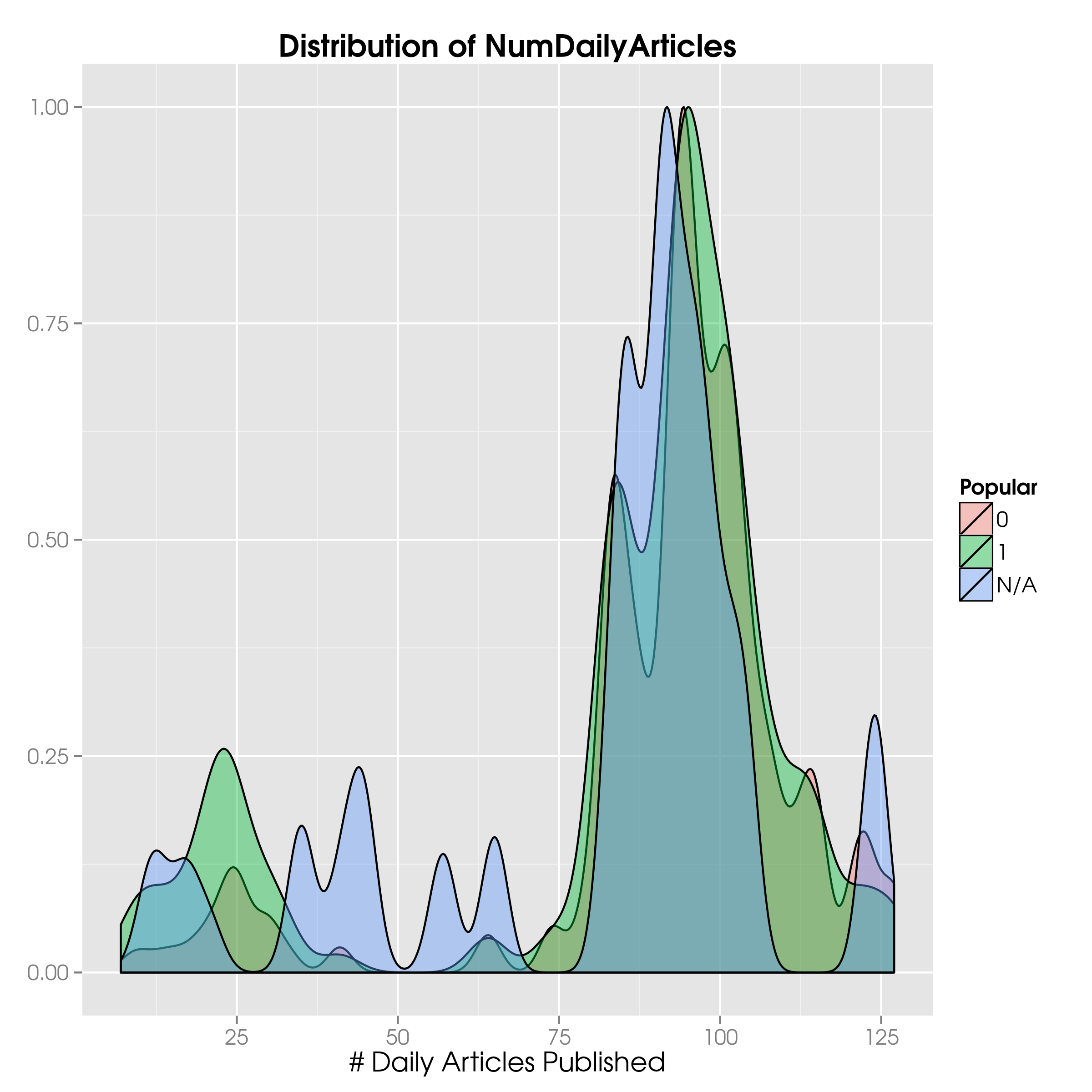
First, there is no easily discernible difference in the distributions.
The only difference that can be seen is in the lower range, where more popular than unpopular articles pop up.
This is reflected in the means being different, and — according to our faithful t-test — significantly different, well below the threshold for the 95% confidence level.
The variance for popular articles is also larger, and different as we can easily see with var.test(...).
Is this difference due to the fact that some days of the week have fewer articles published per day?
A simple call to cor(...) tells us that the correlation between the number of articles published per day and the day of the week is a meagre 0.07, so multicollinearity is unlikely to cause us any headaches.
Again, we have to make use of the conversion trick.
Second, the training set has a gap between 41 and 64 articles.
This gap does not exist in the test set, although there is still a gap around 50 daily posts.
This means that for a certain range of NumDailyArticles values the training set does not provide any clues for the test set.
We can but hope that other predictors are more helpful.
Articles Per Hour and Section
We can obviously do the same by hour and even consider the number of articles by news desk or section. After all, when someone is mainly interested in politics and many articles are posted during a certain time frame, either a few hours or a day, that person may not be able to comment on more than a few articles.
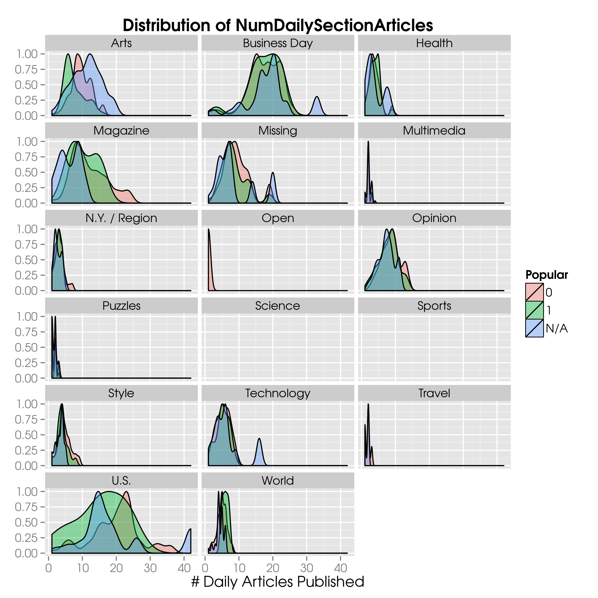
As an example, let’s look at the number of blog posts published per day per section:
DailySectionArticles        = as.data.frame(table(News$PubDay, News$SectionName))
names(DailySectionArticles) = c("PubDay", "SectionName", "NumDailySectionArticles")
News                        = merge(News, DailySectionArticles, all.x=TRUE)

ggplot(News, aes(x=NumDailySectionArticles, fill=Pop)) +
  geom_density(aes(y=..scaled..), alpha=0.4) +
  ggtitle("Distribution of NumDailySectionArticles") +
  xlab("# Daily Articles Published") +
  scale_fill_discrete(name="Popular") +
  theme(axis.title.y = element_blank()) +
  facet_wrap( ~ SectionName, ncol=3)
Although it is hard to see what’s going on, a clear difference between popular and unpopular articles is in the section Magazine, where around 15 articles posted per day is more indicative of popular articles than unpopular ones. Beyond 20 posts per day the roles are clearly reversed.
We can easily adapt our code to display the number of articles published per hour:
HourlyArticles        = as.data.frame(table(News$PubDay, News$Hour))
names(HourlyArticles) = c("PubDay", "Hour", "NumHourlyArticles")
News                  = merge(News, HourlyArticles, all.x=TRUE)

ggplot(News, aes(x=NumHourlyArticles, fill=Pop)) +
  geom_density(aes(y=..scaled..), alpha=0.4) +
  ggtitle("Distribution of NumHourlyArticles") +
  xlab("# Hourly Articles Published") +
  scale_fill_discrete(name="Popular") +
  theme(axis.title.y = element_blank()) +
  facet_wrap( ~ Hour, ncol=3)
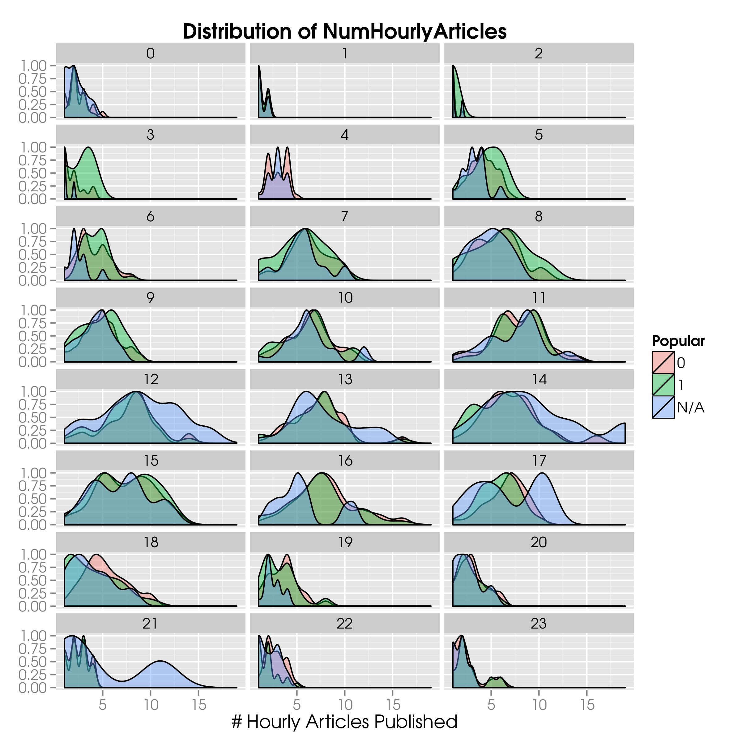
Notice that we include News$PubDay because we want to have the articles published per hour for each given day, not the articles that were, say, published between 10 and 11 o’clock in the morning irrespective of the publication date; what was published and what will be published in the same time frame are obviously not relevant.
Up Next
In the next post I shall talk about feature engineering and the actual predictive model.